User Experience
At Verified, we are experts in how to optimize onboarding flows to maximize conversion and give users the best possible experience. We've helped our customers onboard — and delight! — millions of new users. The user experience described in this guide is the result of countless hours of research, design, testing, and iteration by our team.
Our SDK implements this user experience, and we strongly recommend you use it. If you instead choose to use our API, we recommend you implement a user experience similar to this one.
Full details are below, but the basic user experience is:
- Confirm info (autofilled by 1-Click Signup) or enter info manually
- Confirm health insurance (autofilled by 1-Click Health)
This user experience may look complicated, and in some ways it is: achieving world class UX requires getting many small details right. But at its core, it's simple by design and takes only a few screens. Users complete 1-Click Health in less than 1 minute: try it yourself with a custom demo.
Flow Chart
 ↗️ Open in new tab (for easy zooming)
To implement this user experience yourself (which is only necessary if you choose the API integration type), without our SDK, you need to handle each action labeled Verified.
Screens and Components
Info
If you use 1-Click Signup to autofill inputs for 1-Click Health (which we strongly recommend), you can use the Confirm Your Info screen spec for 1-Click Signup.
If instead you collect inputs manually for 1-Click Health, use the spec below.
 Header
Enter Your Info
Description
We’ll try to autofill your health insurance based on this info, so you don't have to enter it manually.
 First Name
- Required
- Auto focused
- Helper:
Legal first name
Last Name
- Required
- Helper:
Legal last name
Birthday
_ _ / _ _ / _ _ _ _
- Required
- “Birthday” not “Birth Date” because the former is friendlier
- Helper:
MM/DD/YYYY
- Calendar icon on right opens date picker (which defaults to 08/01/1989)
- Opens numeric keyboard
- Accepts only digits
- Accepts OS autofill
- Validates format
- Auto formats to MM/DD/YYYY (most common US format)
Address
- Required, optional, or not included
- Uses third party service (e.g. Google Places API) to show autofill options when the user types
- Expands to show full value (without Address Line 2), in two lines:
{Address Line 1}, {Address Line 2}{City}, {State} {ZIP Code}
Sex
-
Required, optional, or not included
-
Dropdown with options: Male, Female, and Non-Binary
Social Security Number
_ _ _ - _ _ - _ _ _ _
- Required, optional, or not included
- “Social Security Number” not “SSN” (unlike view state) for clarity
- Opens numeric keyboard
- Accepts only digits
- Validates format
- Auto formats to •••-••-NNNN (most common US format)
- Masks first 5 digits, server side not client side
- If starting with value:
- If user starts to edit (by deleting one character), clear entire value
Consent Language
By clicking "Continue", you agree that Verified (
{Brand Name}’s service provider) and its vendors may receive your personal info and provide{Brand Name}with more info about you, including your health insurance.
- Muted color
 Confirm
Confirm
Submits form with user's info.
- Primary color
 Powered by Verified
- Black and Green variant
"Powered By Verified" Graphic Variants
Powered by Verified
Black and Green:

White and Green:

Black:

White:

Gray:

1-Click Signup powered by Verified
Black and Green:

White and Green:

Black:

White:

Gray:

1-Click Health powered by Verified
Black and Green:

White and Green:

Black:

White:

Gray:

1-Click Login powered by Verified
Black and Green:

White and Green:

Black:

White:

Gray:

1-Click Verify powered by Verified
Black and Green:

White and Green:

Black:

White:

Gray:

1-Click Apply powered by Verified
Black and Green:

White and Green:

Black:

White:

Gray:

1-Click Access powered by Verified
Black and Green:

White and Green:

Black:

White:

Gray:

1-Click AutoFill powered by Verified
Black and Green:

White and Green:

Black:

White:

Gray:

Opt Out
Don't Autofill My Insurance
Takes user to manual entry flow.
- Muted color
 View State ↗️
  Modal State ↗️
  Edit State ↗️
Health Insurance
Open Modal
?
Opens informational modal.
- Muted color
Close Modal
X
Closes informational modal.
- Muted color
- Clicking anywhere outside the modal should also close it
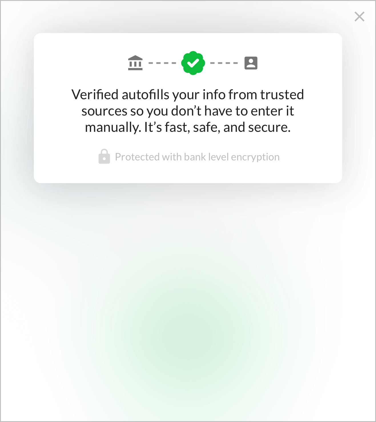
 Informational
Verified autofills your info from trusted sources so you don’t have to enter it manually. It’s fast, safe, and secure.
- Graphic
- Lock icon with:
Protected with bank level encryption
Header
Confirm Your Health Insurance
Description
Make sure everything is accurate.
Powered by Verified
- Black and Green variant
"Powered By Verified" Graphic Variants
Powered by Verified
Black and Green:
White and Green:
Black:
White:
Gray:
1-Click Signup powered by Verified
Black and Green:
White and Green:
Black:
White:
Gray:
1-Click Health powered by Verified
Black and Green:
White and Green:
Black:
White:
Gray:
1-Click Login powered by Verified
Black and Green:
White and Green:
Black:
White:
Gray:
1-Click Verify powered by Verified
Black and Green:
White and Green:
Black:
White:
Gray:
1-Click Apply powered by Verified
Black and Green:
White and Green:
Black:
White:
Gray:
1-Click Access powered by Verified
Black and Green:
White and Green:
Black:
White:
Gray:
1-Click AutoFill powered by Verified
Black and Green:
White and Green:
Black:
White:
Gray:
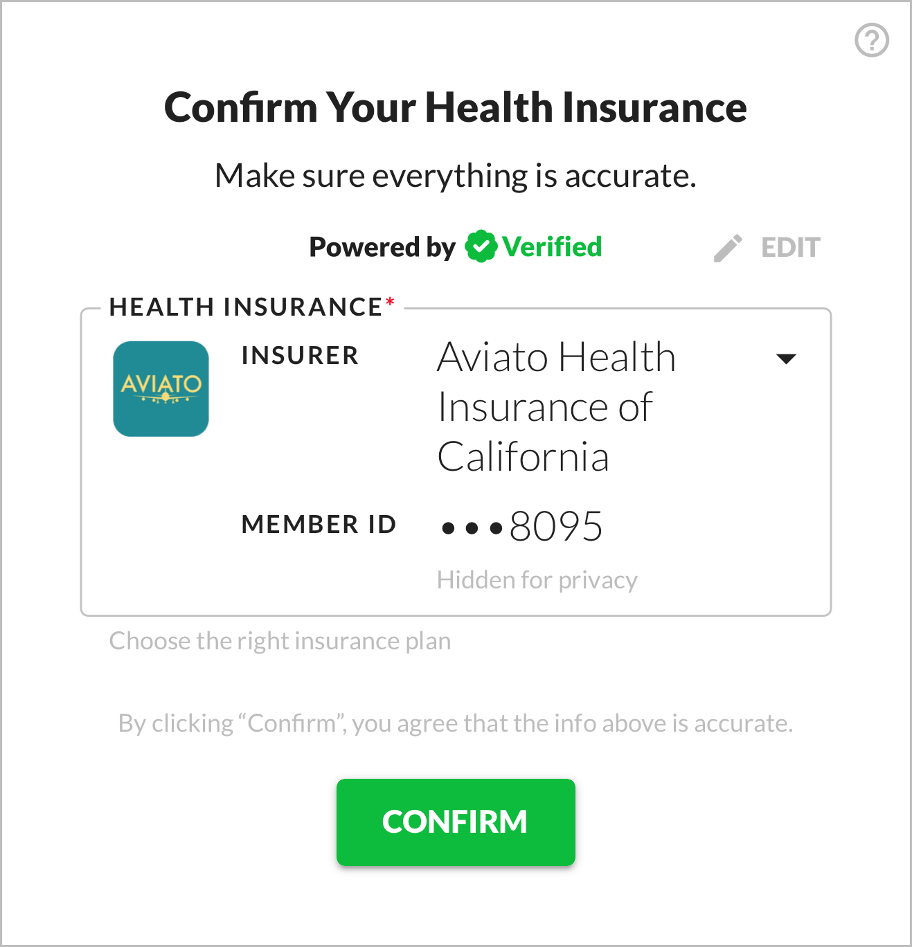
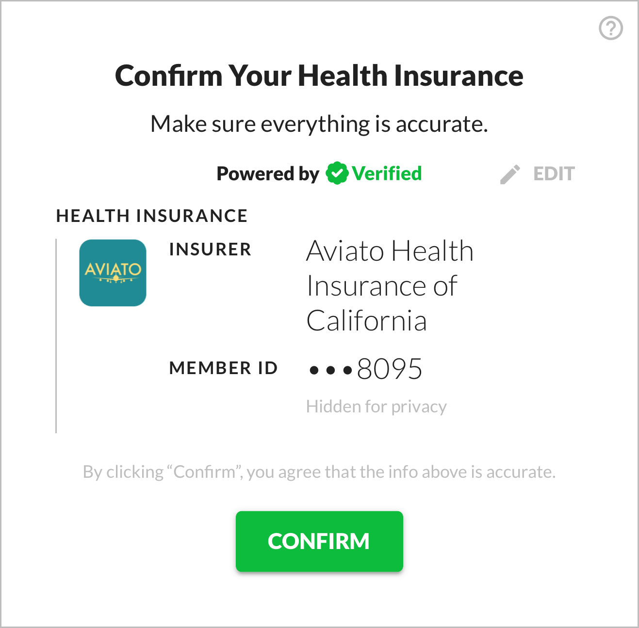
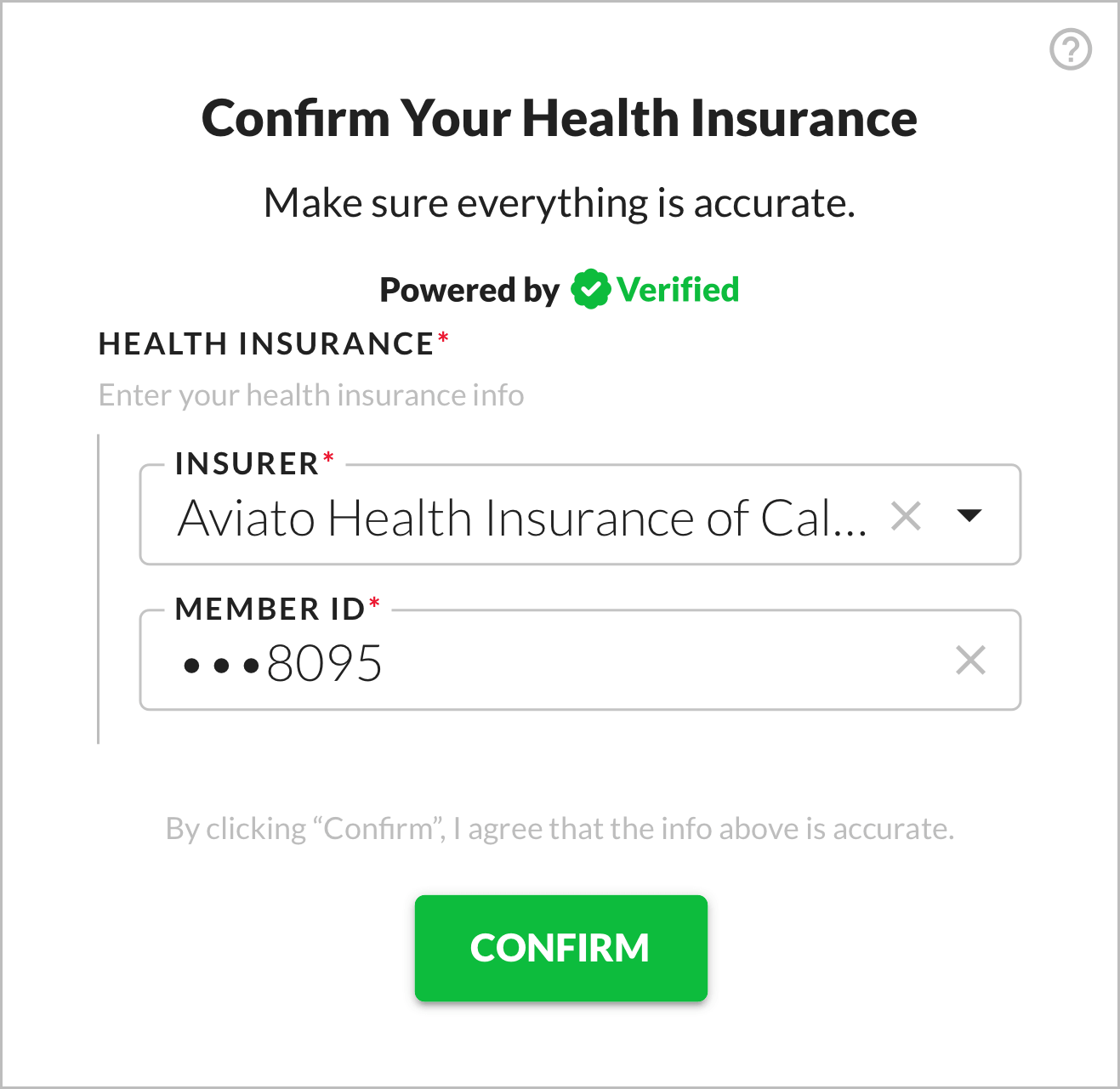
Health Insurance
Health Insurance
Appears in view state.
Contains the two fields described below.
If multiple plans are available:
- Dropdown
- Helper:
Choose the right insurance plan
If only one plan is available:
- Static text
Insurer
Insurer
Appears in view state.
- “Insurer” not “Payer” because the former makes more sense to users
- Shows payer name (
results[i].payer.namefrom API response)
Member ID
Member ID
Appears in view state.
- Middle characters masked.
- Helper:
Partially hidden for your privacy
Edit
Edit
Switches from view to edit state.
The entire data display area should be clickable as the Edit button, not just the button itself.
- Muted color
Insurer
Appears in edit state.
- “Insurer” not “Payer” because the former makes more sense to users
- Uses value selected in dropdown (from view state), if multiple values are available
- Has clear ("X") button on right side that appears if there's any value
- Uses
GET /1-click/health/payersto show autofill options when the user types
Member ID
Appears in edit state.
- Opens alphanumeric keyboard
- Uses value selected in dropdown (from view state), if multiple values are available
- If user starts to edit (by deleting one character), clear entire value
Accuracy Confirmation
By clicking “Confirm”, you agree that the info above is accurate.
- Muted color
Confirm
Confirm
Submits form with user's info.
- Primary color
 View State (Multiple Plans) ↗️ Open in new tab
 View State (Single Plan) ↗️ Open in new tab
 Modal State ↗️ Open in new tab
 Edit State ↗️ Open in new tab